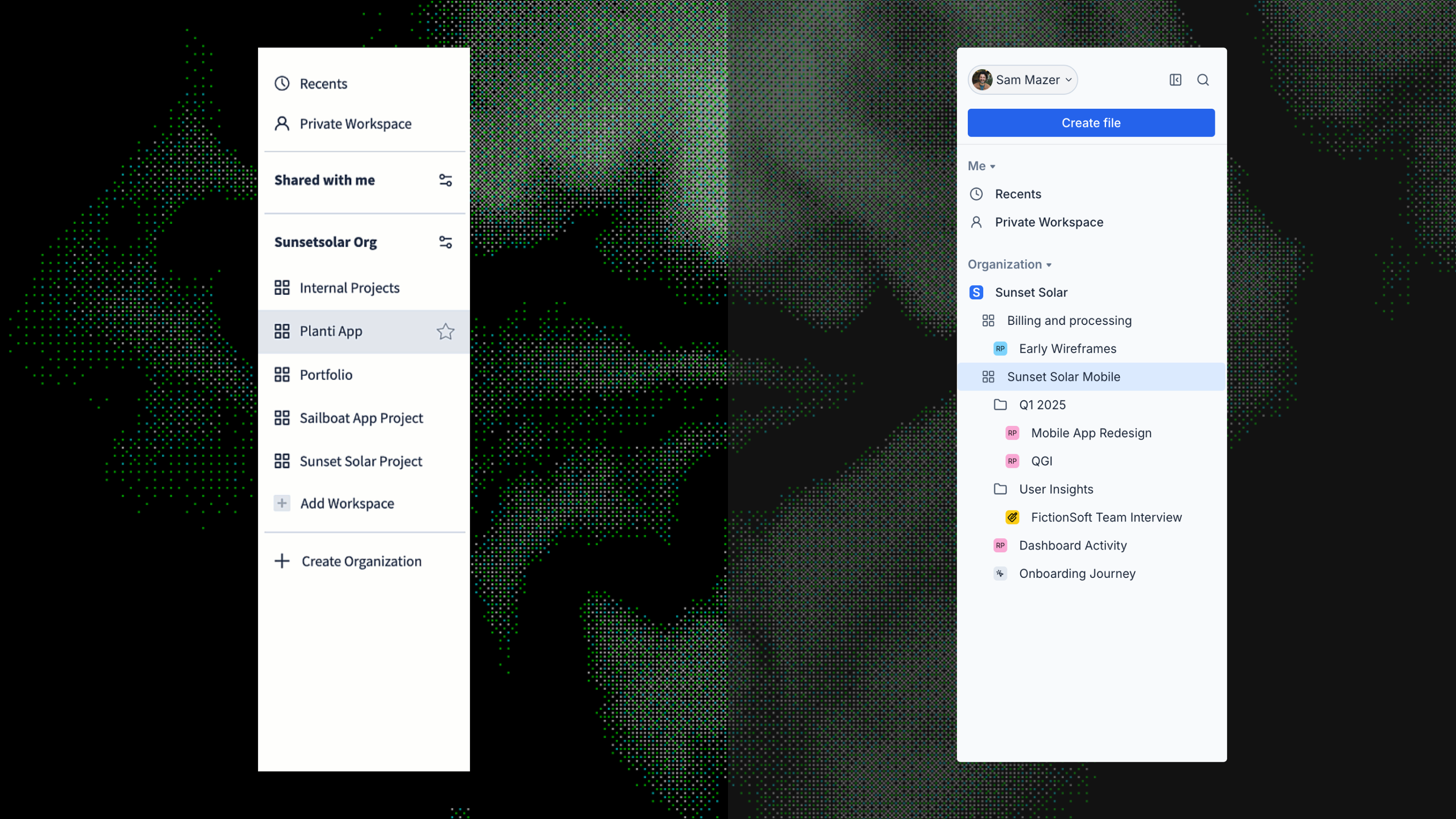
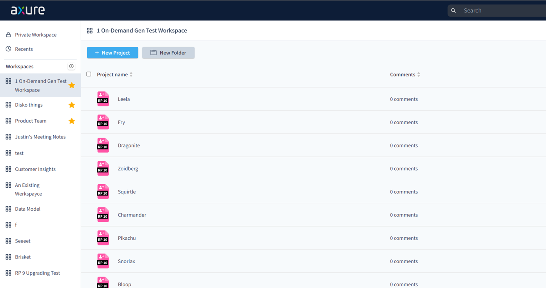
Axure Cloud 3.0: Leading as PM and Product Designer, discovery to design to launch

Led Axure Cloud's major refresh end-to-end as PM and Product Designer: design system and UI refresh in Figma, and 7 shipped improvements, 8 user interviews.

Product Manager and Product DesignerFeb–Dec 2024B2B SaaS / Design & prototypingFigma, Axure Cloud, Jira, Axure RP, Vue 3, Tailwind CSS, Lucide, TanStack Vue Query, Reka UI

Company context

Axure Cloud is where teams share Axure RP prototypes, specs, and design files. Product managers, designers, and business analysts use it to review work together. Axure runs a small product team, so PMs own discovery, prioritization, and design together, there is no handoff between PM and designer because they are the same person. The app had grown on an older multi-page stack and the UI was feeling dated and slow as usage increased. We decided to move Cloud to a modern Vue 3 single-page app and refresh the design so it was ready for the beta release of Axure Whiteboards and Documents. I led the project as both Product Manager and Product Designer, from research and prioritization through design, migration planning, and launch.

Mandate

One mandate was to turn Cloud from a place people would publish and share files-like Dropbox-into a place they could create files and be productive in-like Notion. The other was to ship a major update that rewrites the front end as a Vue 3 SPA, modernizes the visual design, and makes navigation feel fast, with a focused set of features that make files, workspaces, and settings easier to find and manage, without breaking existing projects or integrations.

  • No breaking changes to existing links or embeds in this release
  • Design refresh had to feel cohesive across Cloud and RP sign-in flows
  • Target: ship before end of 2024 to align with annual planning and renewals

My contributions

PM: Discovery and prioritization

As Product Manager, I pulled together customer feedback, tickets, and notes, talked with CSMs, and ran 5 customer interviews to shape the problem and scope. I used that input to decide what we would ship now, what could wait, and how to sequence the work.

Product Designer: Design system and UI refresh

As Product Designer, I built the design system in Figma from scratch and refreshed the UI. I owned visual direction, components, and specs, and worked directly with engineering so the designs stayed aligned with what we could build on the new stack.

Dual role: Sequencing and launch

Because I owned both PM and design, I could plan the Vue 2 to Vue 3 migration, design refresh, and feature work as one release. I also led the December 10 launch, including the changelog and blog post, so customers and prospects saw a single clear story.

Problem

Front App tickets, CSM conversations, and internal feedback kept coming back to the same themes: navigation felt slow, it was hard to find files, and settings were spread out. In customer interviews, people described the problem less as "slow" and more as "I can't get back to what I was just doing". No one complained about the visual design on its own.

CSMs were answering the same questions over and over: where do I find this, how do I get back to that file. That pointed to discoverability issues, not just performance. Scattered admin settings were a steady source of pain for enterprise accounts and a common support ticket type. Sales also needed a clearer before-and-after story to support renewals.

Whiteboards and Documents were set for beta release, with Cloud as the front door, so keeping a slow, dated experience there would undercut both launches. Internal interviews with CSMs also surfaced renewal conversations where customers were asking directly about a Cloud update. Together, the user signal, upcoming launches, and renewal timing made this the right quarter to invest.

Pre-refresh Axure Cloud: navigation and layout before the update.
01

Research and framing

01

Internal synthesis

I pulled customer tickets and notes together. Two patterns stood out: people were having trouble finding files and navigating felt slow.

02

Internal interviews

I ran 30-minute sessions with engineering and support. Users did not usually say "this is slow"; they said "I can't find it." Speed and discoverability were being mixed together in the support data, which helped narrow the problem.

03

Customer recruitment

I recruited 5 participants from our user council.

04

Customer interviews

In 5 customer sessions, the main frustration was the combination of slow page transitions and no fast way back to recent work, not either issue on its own. Comments and activity also came up as secondary pain points. No one raised visual design as a problem.

05

First design pass

Once the problem frame was clear, I designed quick search and recent files in Figma as the main changes, with settings consolidation and an activity feed as supporting work.

06

Internal validation

I shared the designs with engineering and product leadership.

07

External validation

I then ran follow-up sessions with customers using Axure RP prototypes. Cmd+K search was intuitive, workspace-scoped recent files matched expectations, and centralized settings tested well with admins, so we did not need big direction changes.

Challenges

  • Migrating the front end from the legacy multi-page stack to a Vue 3 SPA meant rebuilding routing, state, and key flows without breaking existing shareable links. Cloud links are deeply embedded in customer workflows, so this was a hard constraint.
  • Upgrading from Vue 2 to Vue 3 in the same release window required tight scope; we had to plan the migration so it did not block or delay feature work.
  • Settings and workspace logic were spread across multiple areas.

Key decisions

Scope to seven improvements, not ten.

Internal work and CSM interviews surfaced more than ten possible improvements, but I limited the release to seven. Only problems confirmed in customer interviews and validated in design reviews made it into scope; three candidates were pushed to a later release.

Make the sidebar the anchor of the refresh, with Whiteboards in mind.

Whiteboards was coming as a full-screen canvas experience, so the sidebar would become the primary way users navigate and return to files without losing context. We prioritized a revamped sidebar - collapsible for focus, with quick search (Cmd+K) and workspace-scoped recent files - so it could support the Whiteboards workflow and feel like the reliable home base for the rest of Cloud.

Replace dialogs with popovers wherever possible.

In line with the speed mandate, we audited every modal dialog in Cloud and converted inline actions - changing workspace ownership, moving files, renaming - to popovers. Dialogs halt the user's flow and feel heavy for small tasks. Popovers keep users in context and make common actions feel instant, which reinforced the overall goal of making Cloud feel like a fast, modern app.

Cut the Notifications Inbox from scope.

One of the features I wanted to ship was a Notifications Inbox, a dedicated place for users to see all their notifications and pending work in one view. The problem it solved was real: users received email notifications but struggled to find the work they needed to do. But internal validation showed we were solving a problem that was not happening often enough to justify the effort. I cut it from the release and flagged it as a high-priority candidate for the next cycle.

02

Design and delivery

We rewrote Axure Cloud as a Vue 3 single-page application and refreshed the design across the product. In-app navigation no longer triggers full page reloads, so moving between files, workspaces, and settings feels fast. We shipped seven improvements: a revamped sidebar with a global create button, expandable workspace navigation, and a collapsible mode; quick search and recent files; better comments with search and sort; Browse Workspaces; a clearer activity feed; the ability to move workspaces between organizations; and centralized settings.

Before: previous Cloud layout and navigation.After: refreshed design with quick search and recent files.

Revamped sidebar

The sidebar had no fast path to create a new file, users could not see the contents of a workspace without navigating away, and there was no way to get the sidebar out of the way when working in a full-screen Whiteboard.

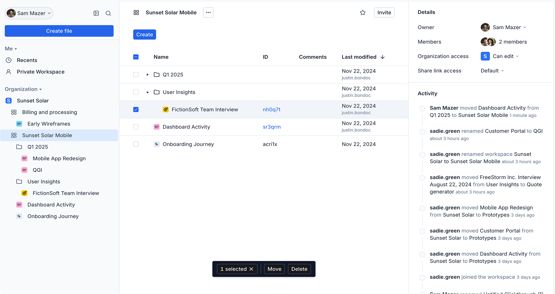
We added a global create button at the top of the sidebar as a company mandate ahead of the Whiteboards launch, giving users a direct path to start whatever they needed. We moved from a flat Slack-like workspace list to a Notion-like expandable model so users could see workspace contents inline without losing their place. We also made the sidebar collapsible, giving users a true full-screen mode when working in Whiteboards.

Quick search and recent files

It was slow and clumsy to find files, folders, or workspaces or to return to recent work.

Quick search (Cmd+K on Mac, Ctrl+K on Windows) lets users jump to files, folders, and workspaces. Recent files in the sidebar give a simple way back to what they were just working on.

Before: no quick searchAfter: quick search (Cmd+K) and recent files

Workspaces and settings

It was hard to discover and join workspaces, settings were scattered across multiple areas, and moving workspaces between organizations was not supported.

Browse Workspaces makes it easier to find and join organization workspaces, workspaces can be moved between organizations, and settings now live on a single centralized page.

Before: workspaces and settingsAfter: workspaces and settings
03

Outcomes and learnings

8

Customer interviews conducted

7

Improvements shipped

<100ms

In-app page switches

  • Moving to a Vue 3 SPA removed full page reloads on navigation. In-app page switches are now under 100ms.
  • Navigation feedback was consistently positive after launch, one user put it directly: "I like the nested folder structure in the sidebar so I don't need to jump in and out of workspaces. Much easier navigation." We didn't receive a single support question about navigation in the weeks after launch, which was a meaningful signal given how much of the pre-launch feedback had been about getting lost.
  • Choosing Vue and Tailwind for the project paid off in speed later on, though there was a real learning curve up front.